
Lifestyle Apparel • Brand Strategy • Visual Identity
VELOS
Engineering Forward Momentum for VELOS
In the highly saturated lifestyle and apparel market, brands often struggle to find their footing between two extremes: they either lean too heavily into fleeting, chaotic streetwear trends, or they become sterile, generic athletic wear.
Here is our methodology for designing VELOS — a brand engineered to bridge the gap between progressive modern style and classic sophistication.
The Before State
The Cluttered Lifestyle Market
The modern consumer demands versatility from their apparel — clothing that feels dynamic but retains a premium, timeless edge.
Market Position
VELOS operates as a contemporary lifestyle brand aiming to resonate broadly across diverse demographics.
The Bottleneck
To stand out in a crowded market, VELOS needed an identity that didn’t just rely on a cool logo. It needed a visual system that communicated sophistication, versatility, and relentless forward momentum without alienating its broad target audience.
The Strategic Insight
“Progressive, Yet Classic”
We bypassed standard, aggressive activewear tropes and anchored the brand in the concept of Timeless Ascension.
The Pivot
We positioned VELOS not just as an apparel company, but as a catalyst for movement.
The strategy was to build an identity around “Progressive Classicism” — proving that a brand can be fiercely modern and forward-thinking while remaining grounded in refined, professional design principles.
Actionable Design Decisions
What the strategy unlocked
Abstract concepts of momentum and versatility were translated into a highly structured, scalable visual identity. Every design choice was engineered for maximum impact and minimal clutter.
The Geometric Brandmark
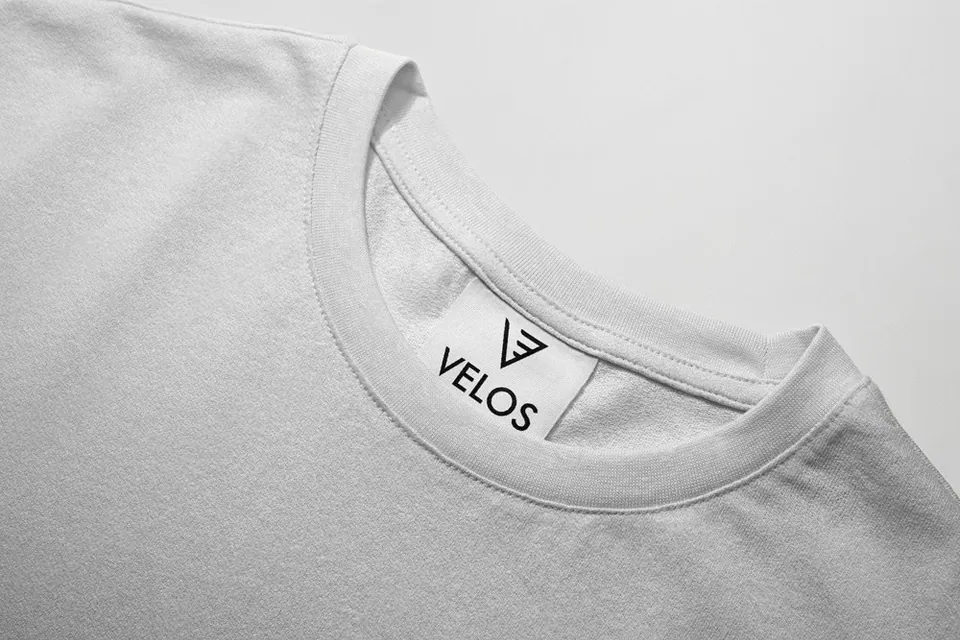
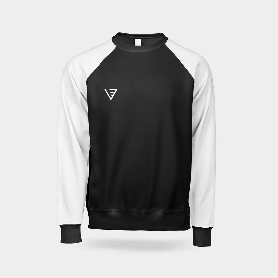
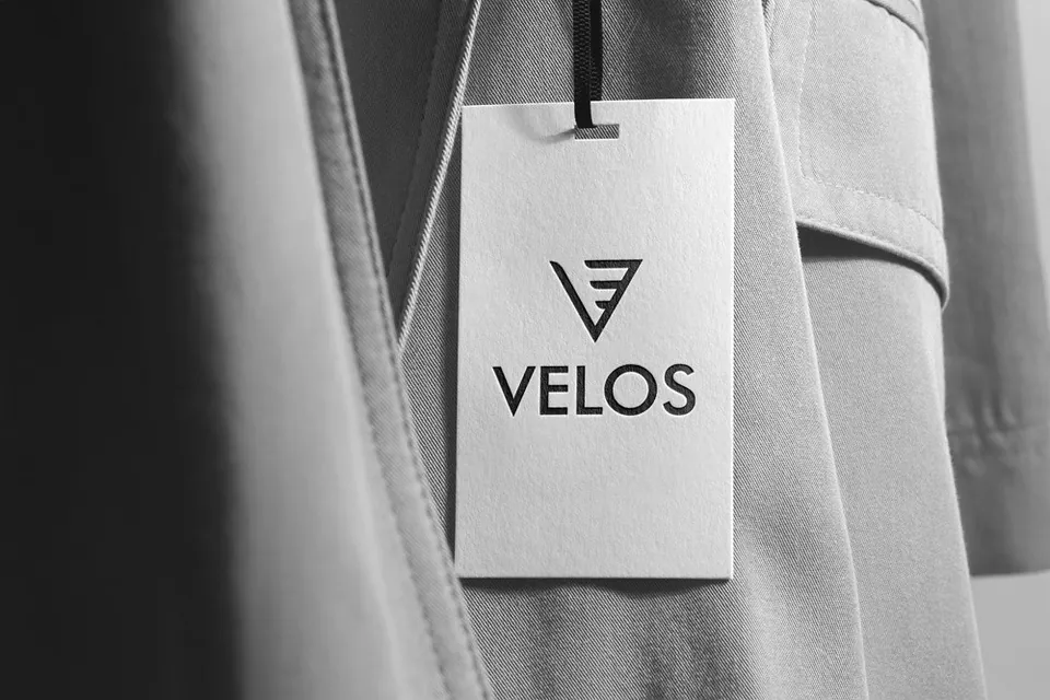
We engineered a sharp, minimal symbol defined by geometric precision. The mark visually captures the brand’s emphasis on forward momentum and ascension. Because it follows a strictly minimal style, it refuses to lose its structural sanctity whether printed massively across a hoodie or scaled down to a 64px digital favicon.
Engineered Precision (Futura)
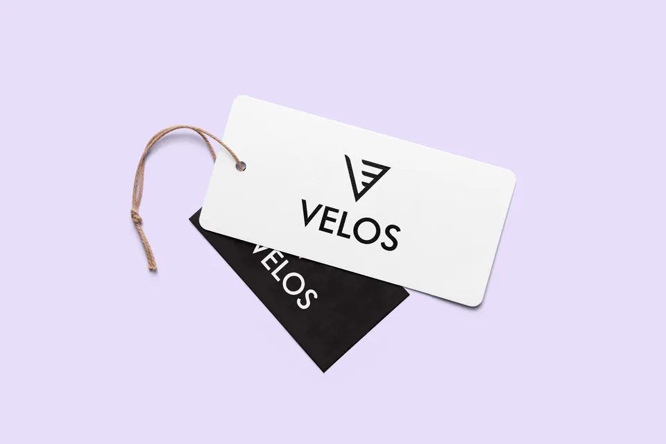
We selected Futura as the brand’s typographic voice. Known for its geometric exactness and balanced proportions, it strikes the perfect equilibrium between a classic foundation and contemporary style. It gives the brand a refined, professional look that elevates it above basic streetwear.
The Contrasting Palette
We deliberately avoided the loud, neon colors typical of the activewear space. Instead, we developed a palette anchored in a deep, authoritative Charcoal Black. To give the brand its “progressive” edge, we introduced a sophisticated, unexpected light support color, “Soft Rose/Blush.” This combination immediately signals premium lifestyle rather than just gym wear.
Hero Visuals · Strategy in Application
One system.
Every touchpoint.
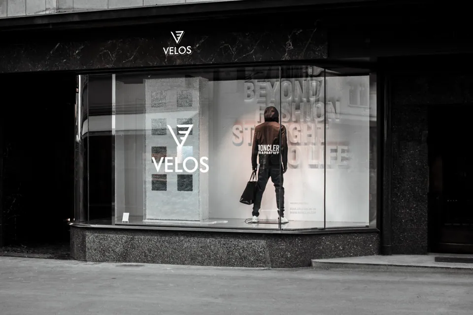
An apparel brand’s identity lives and dies by how it applies to physical garments. We proved the structural integrity of the VELOS identity across core lifestyle touchpoints:
Statement Apparel
Bold, high-contrast typography and logo placements on premium hoodies (incorporating the strategic brand messaging “ASCEND”), proving the brand can carry bold streetwear aesthetics.
Tactile Accessories
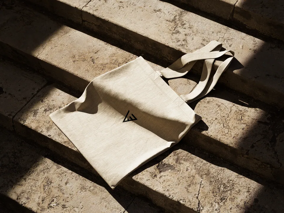
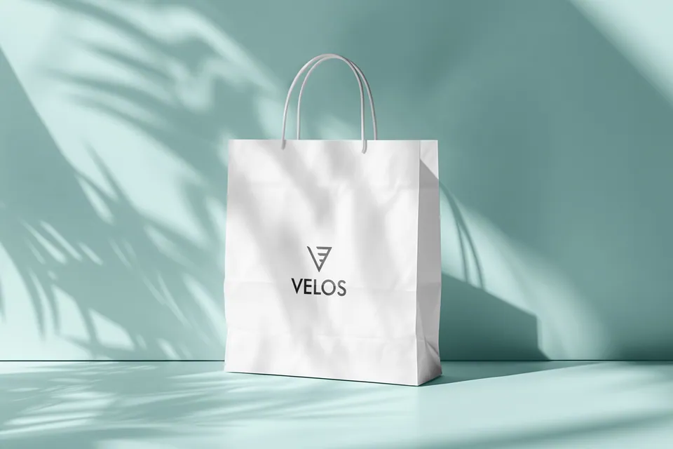
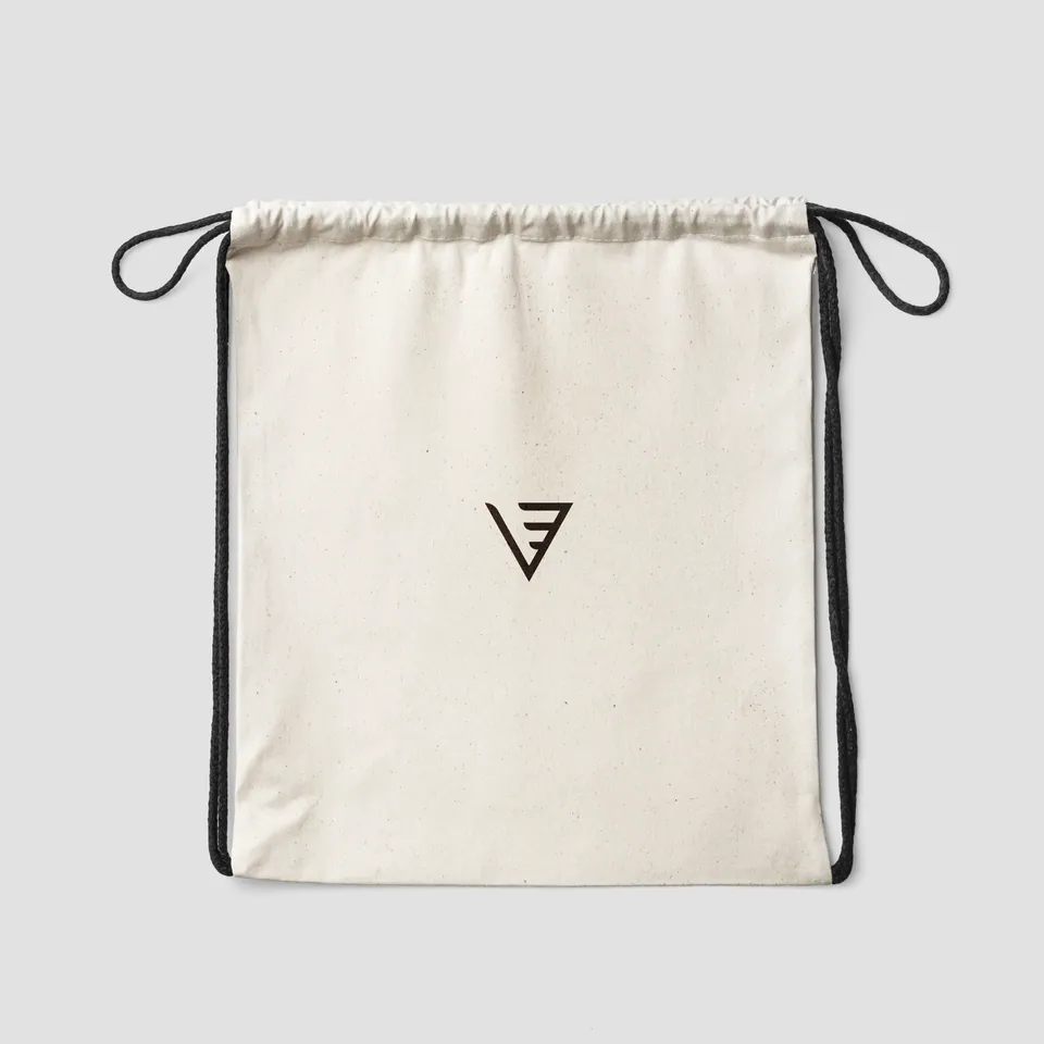
Clean, minimalist logo applications on lifestyle bags, demonstrating how the brand scales gracefully into premium, everyday carry items.
The Outcome
A Brand Built to Ascend
VELOS now possesses an identity that transcends temporary fashion trends.
Broad Demographic Appeal
By balancing sharp geometric precision with a sophisticated, restrained color palette, the brand successfully claims the highly coveted sweet spot between classic wear and modern momentum.
Versatile Scalability
The identity is built for longevity. It is as memorable on a digital storefront as it is embroidered on physical apparel, providing a flawless foundation for future product line expansions.
Want this kind of clarity for your brand?
Apply for the Basirah Brand Audit